
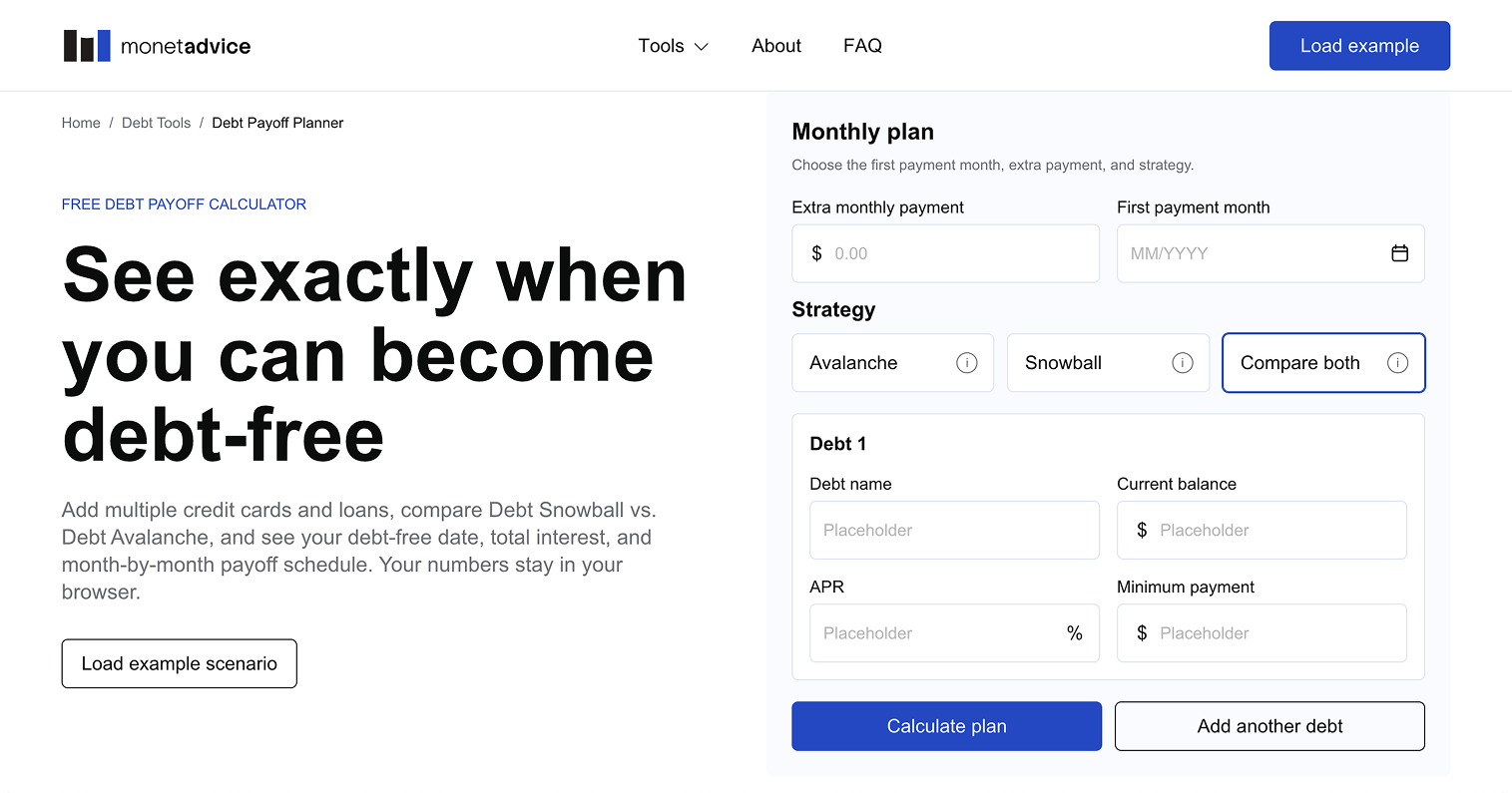
Monetadvice
MonetAdvice is a mobile-first financial decision platform for the US market. It helps people compare debt repayment strategies, understand interest costs and see how additional payments can shorten their debt-free timeline.
Product design
Scope
Product strategy, UX/UI design, Design system, AI-assisted product delivery, QA, SEO, Analytics
Role
Product Designer
Platform
Responsive web product
Status
Live and continuously evolving
Finding a product worth building
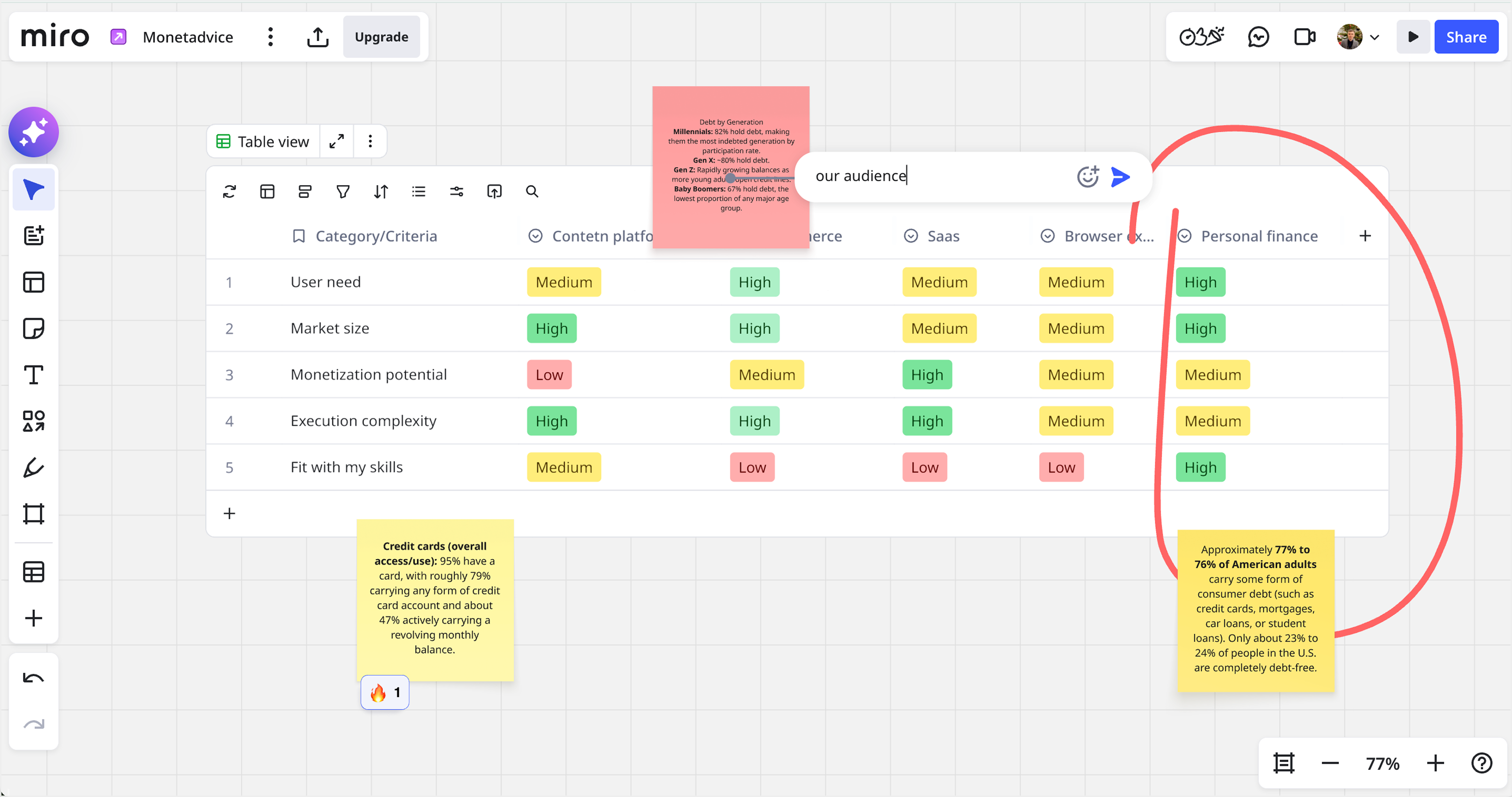
I wanted to create a real digital product with long-term usefulness and monetization potential.
I explored several directions including content platforms, e-commerce, SaaS, browser extensions and personal finance, comparing them by user need, market size, monetization potential, execution complexity and fit with my skills.
The US personal finance market stood out because debt and credit products are widely used, while repayment decisions are often difficult to understand.
Starting with one clear problem
I focused the first version on debt repayment and built a growing set of calculators around common user questions:
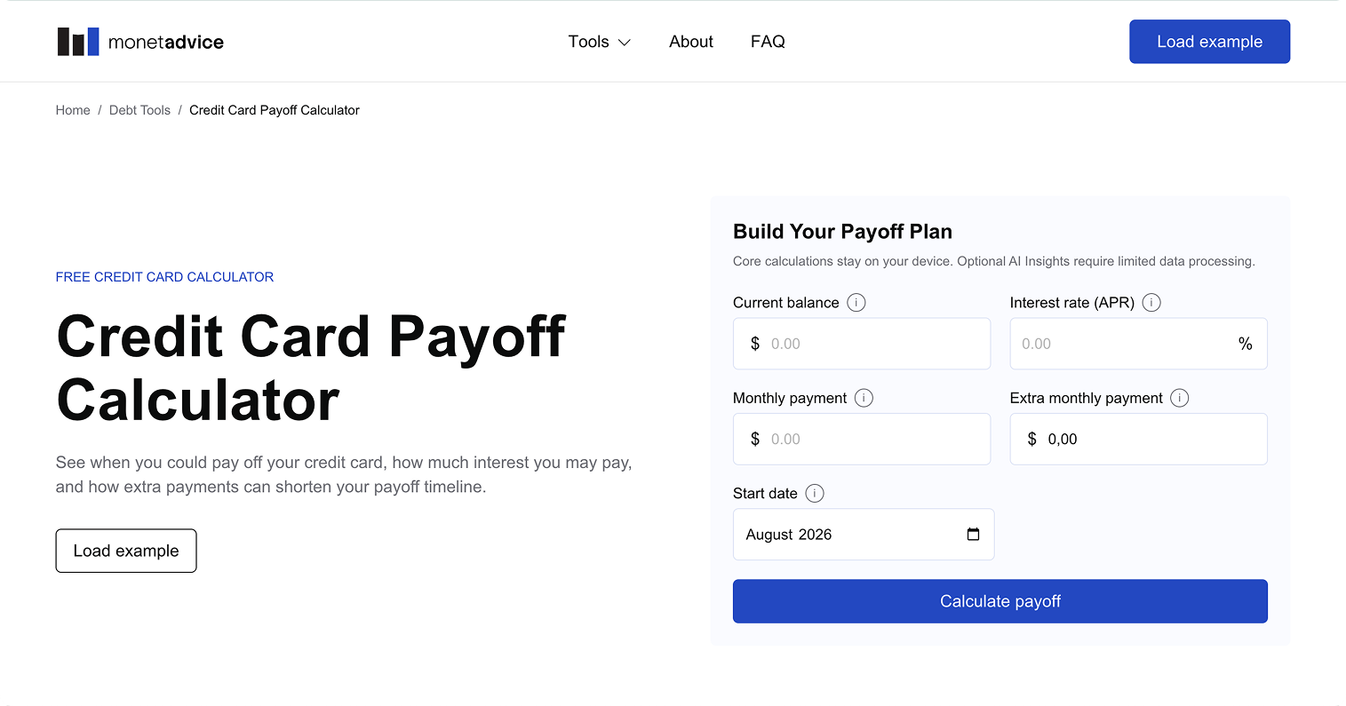
Credit Card Payoff Calculator
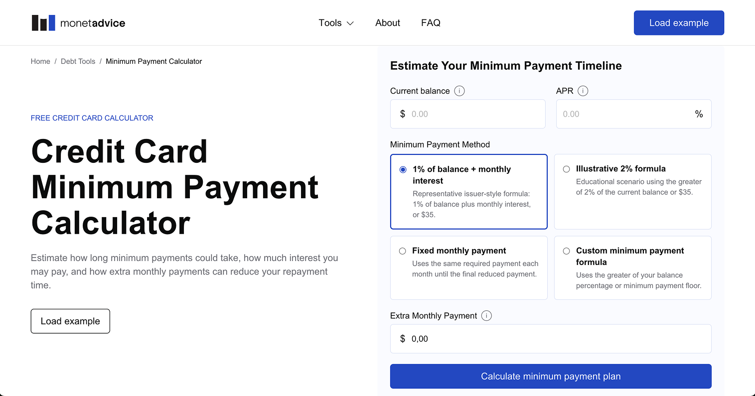
Minimum Payment Calculator
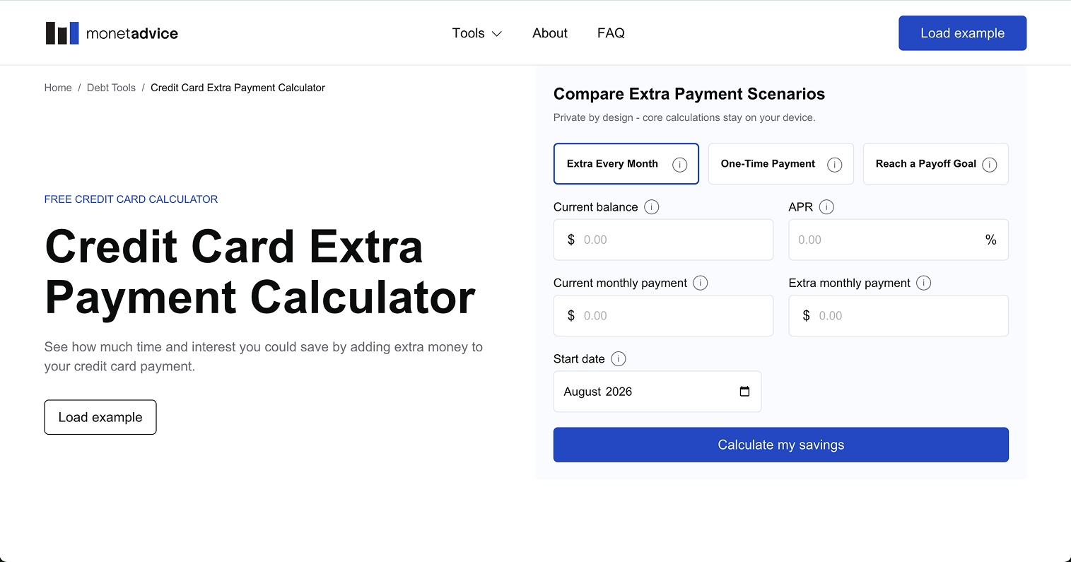
Extra Payment Calculator
The goal was simple: help users understand the financial impact of their choices without overwhelming them with complex formulas or dense tables.
Making financial tools feel simple
Financial products already require a lot of cognitive effort, so the interface intentionally avoids unnecessary decoration.
My main design principles were:
- Mobile first
- Clear hierarchy
- Plain language
- Progressive disclosure
- Minimal visual noise
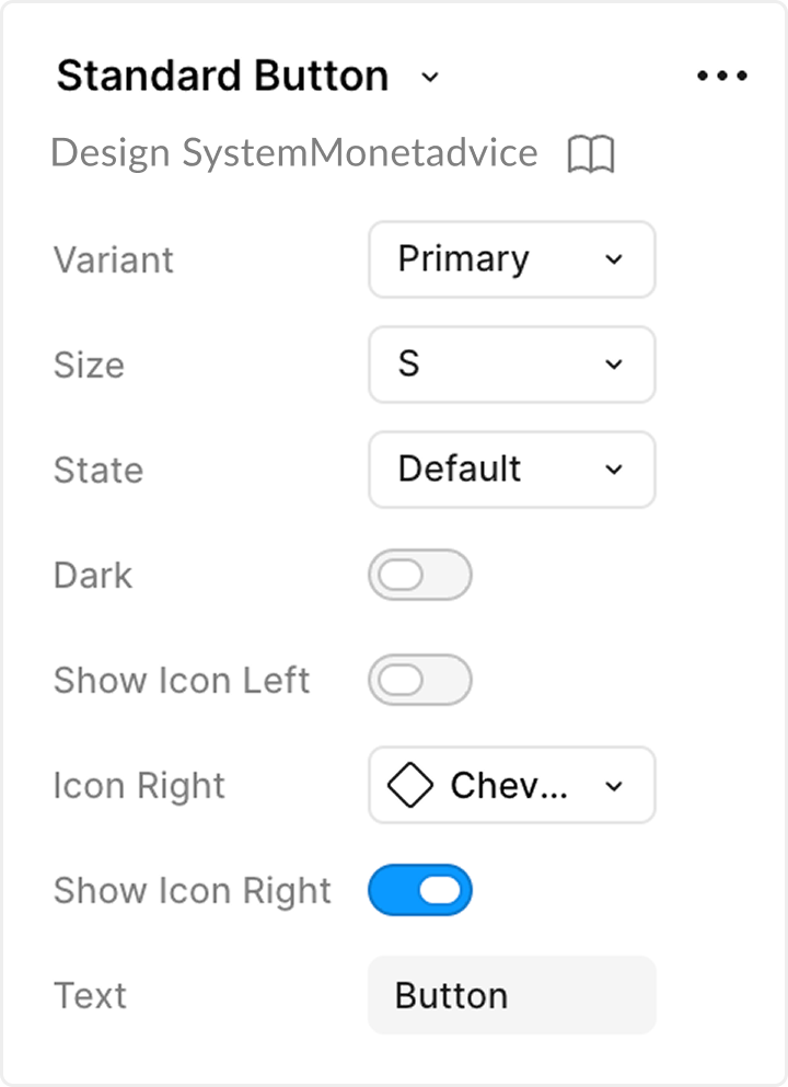
I also built a reusable Figma Design System for forms, validation, cards, tables, charts, tooltips and responsive states, allowing new calculators to be added consistently.
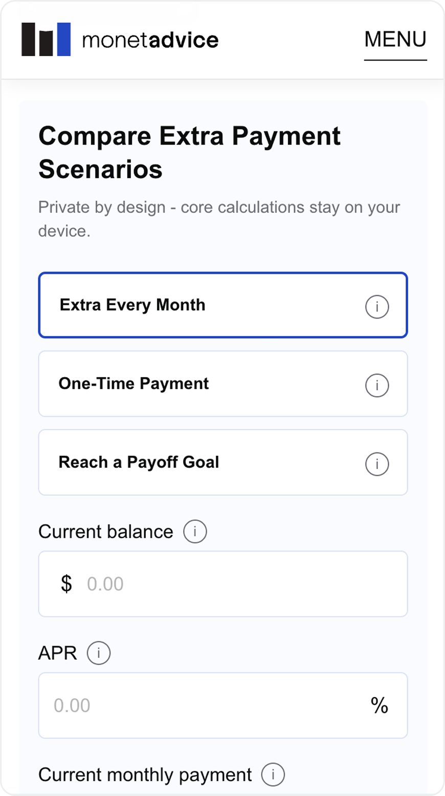
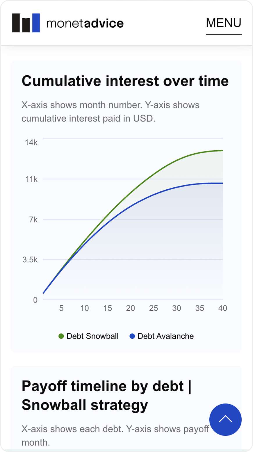
Design System
Built a scalable Design System in Figma based on Atomic Design principles to support the long-term growth of the product.
It establishes consistent patterns for forms, validation, data visualization and responsive layouts, allowing new calculators and features to be added faster while maintaining a cohesive user experience.
Includes: Typography • Color System • Components • Form Controls • Validation States • Cards • Tables • Charts • Tooltips • Navigation • Design Tokens • Figma Variables • Responsive Patterns


Design Decisions
Keeping the first step simple
Keeping the first step simple
Challenge
Users often arrive with limited financial knowledge and may not know all of their loan details.
Decision
I reduced the initial form to only the information required to generate a meaningful first result.
Advanced options remain available but don't interrupt the primary flow.
Why
Reducing the number of required inputs lowers cognitive load and helps users reach their first result faster.
Launching early and learning
from real data
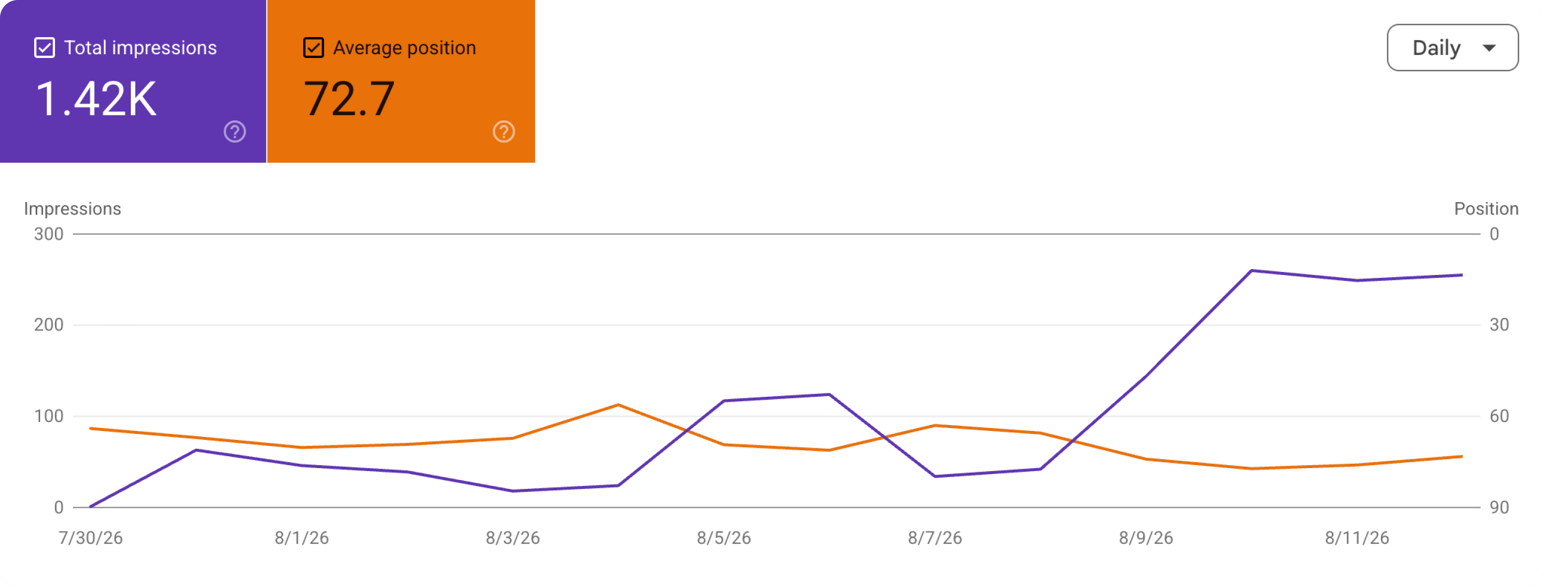
After launch, I connected Google Search Console and Google Analytics to understand how the product performed outside Figma.
- 1 Build
- 2 Launch
- 3 Measure
- 4 Learn
- 5 Iterate
On July 30, I released the Credit Card Minimum Payment Calculator. After Google indexed the page, search impressions increased immediately.
The numbers were still early-stage, but the signal helped validate the topic and influenced what I decided to build next.
From Figma to a working product
I designed the UX/UI in Figma and used Codex as an AI development copilot.
- 1 Figma
- 2 Requirements
- 3 Codex
- 4 Review
- 5 Test
- 6 Release
I defined requirements, provided designs and references, reviewed the generated implementation, tested the product and directed further iterations until the result matched the intended experience.
AI accelerated implementation, but product direction, UX decisions and final quality remained my responsibility.
A live product, not a finished case study
MonetAdvice went from an initial idea to a live, indexed financial product.

Today I continue adding new calculators and improving the experience based on search data, analytics and product insights.

This project gave me hands-on experience across the full product lifecycle — from opportunity research and UX/UI design to launch, measurement and continuous iteration.
